No matter what your web designer tells you, simplicity is best when building your small business website. While having a website with lots of bright colors and flashy interactive graphics might win web design awards, it will probably not help you win customers. In fact, the more complicated your web design, the higher the risk that your sales message will be lost amidst all the fancy bells and whistles on your site.
For most small businesses, a simple and elegant four or five page website is all they need to get the job done. If you want your small business website to increase your profits instead of emptying your pocketbook, pay close attention to the following design guidelines when you build your site.
Make Your Website Easy to Read
In order for your website to get sales and/or leads, your small business website design needs to be user and consumer-friendly – that means it needs to be easy to read. So, short sentences and paragraphs, dark text on white (or very, very light) backgrounds and lots of white space should be the norm.
At the risk of sounding like a broken record, I’ll say it again – the purpose of having a website for your small business isn’t to win design awards. It’s to convey information about your product or service that guides the consumer toward making a buying decision in your favor.
If you think that dark websites and colored text on colored backgrounds looks better, you may be right. However, as I mentioned earlier loud colors and excessive graphics only serve to distract attention from the sales message contained in your site content and makes your site harder to read. Remember: keep it simple and you’ll keep the sale.
Also, remember that web users tend to scan text instead of reading it start to finish like printed text. Since the majority of your visitors will not read all your content, use headlines, subheadings, and bolded text that quickly convey your overall message. Done correctly, a visitor should be able to scan all your headlines, subheads, and bold text in just a few seconds and understand the central message of your site or page.
Make Your Website Easy to Navigate
Since the chief purpose of your site is to convey information, you should design your website so the information it contains is easy to find. If you make it easy for your visitors to navigate your site, they’ll thank you with their dollars. Make it difficult, and they’ll leave your website before you can say “Google.”
At the bare minimum, you should have a navigation bar on every webpage that includes a link back to your home page and to every top-tier page in your website. In addition, you should consider placing links back to the previous page visited at the top and bottom of the current page. Some websites use “bread crumbs” for this purpose – a “trail” of links that show each page visited since landing at the site.
Lastly, make sure that there are no broken links on your website. Broken links may not seem like a big deal to you, but to a site visitor who was clicking on a link for more information they are a major frustration. Fix your broken links!
Oh, and incidentally, making your site easy to navigate will also help the search engines optimization to find and index all your pages, which might help you get more traffic over the long haul.
Make Sure Your Website Loads Quickly
Despite the fact that high-speed internet access has become very affordable and accessible in recent years, many web users are still using dial-up connections to access the internet. Note that these people get very frustrated when they have to wait five minutes for your webpage to load. You will lose these visitors if your web page files are too large and take too long to load.
Keep photos, graphics, and animations to a tasteful minimum on your websites, and keep your total page size under 50K to ensure maximum usability for your visitors. In addition, avoid using background music on your pages unless it is absolutely necessary – music files take time to load, and can annoy your visitors enough to make them leave your site.
By the way, smaller and faster loading pages make it easier for the search engines to spider and rank your site – an added bonus for keeping your page files small and your load times fast.
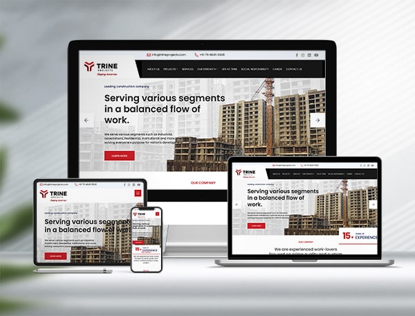
Oh yes, most important is make with Mobile Friendly, (Responsive website layout) so user easily can surf from mobile devise as well.
Hopefully, these guidelines will help you build a website that gets you more sales and leads for your small business. Remember, building a website that your visitors enjoy browsing will boost customer loyalty and encourage repeat sales. Create a fast-loading site that’s easy to read and navigate, and your visitors will thank you with their checkbooks!

