Won’t you just hate it if the click on an ad took you to some unspecified universe instead of directing you to the information you asked for? Obvious, right?
That’s where landing page comes into picture. A landing page is something where your potential customer is directed to after he clicks on your ad campaign. If a person is looking for digital marketing course and he ends up on a page that’s providing him a free digital marketing ebook, it’s more likely he would be further interested in surfing your website. Don’t bombard your customers with unnecessary information by directing him straight to your website.
But generating leads doesn’t just mean designing a valuable offer, the next step would be setting up a landing page. Landing pages are more than just minimal content, simple design, email subscription form or a download button. They are about carefully combining all of these, just enough to create a visually appealing content, grab reader’s attention with an irresistible offer like a cherry on top of a cake!
Hence, what you need is an optimized landing page.
If you have a landing page but still your pay-per-click rates are bothering you then maybe your landing page needs optimization. But the simple fact is that, you can’t get it right the first time; only after testing, launching and optimizing, you can improve the conversion rate. The easier you make it for your customers to understand and navigate your landing page, the more likely they are to convert.
Here are the small tips to improve/optimize your landing page:
Focus On Offering A Single Solution – The first and foremost rule would be providing an offer without any other distraction. It’s like serving your customer only with the food items they like instead of putting them in dilemma by serving plethora of options.
Make sure you include only one offer, like download ebook or subscribe for free or a demo or sending free quotation.
Understand Your Campaign Goals – Make sure that your headline matches with the content of your page. You have just few seconds to grab user’s attention, hence it is essential that it is clean and simple and matches with your campaign goal.
Correct Images – Content is important but images help capture the required attention. The human brain looks at images and color first before consuming any other content. It’s necessary that all the images used should be in sync with the content. Well-chosen and thoughtfully placed images can help you get more conversions.
Using original images with purpose instead of using stock images gained more conversions. Studies have shown that stock images are often ignored by the visitors. Hence, original images that are relevant with the content and create emotional bond with the user should be preferred.
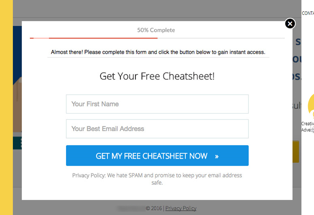
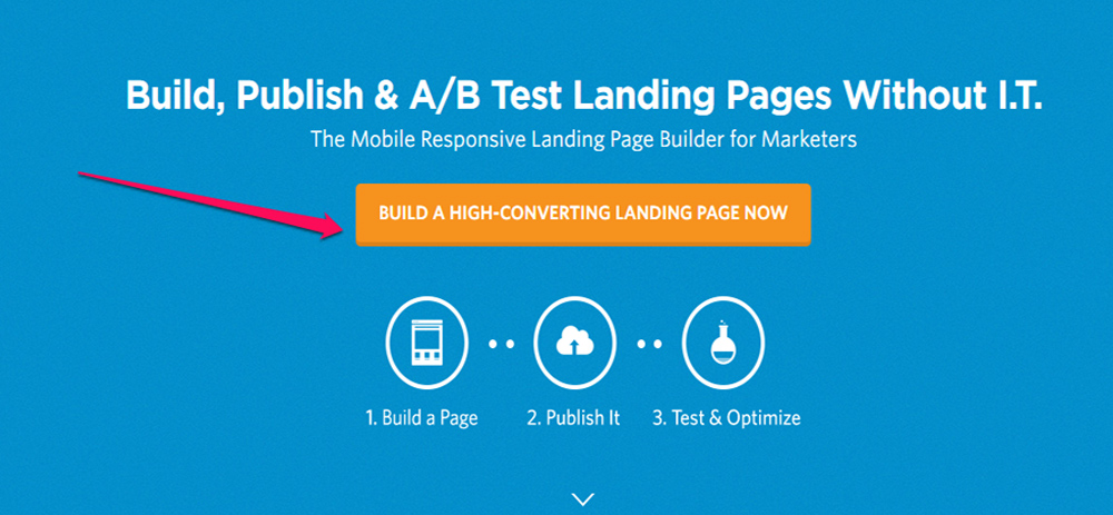
CTA Button – CTA buttons have a very specific goal; to prompt a visitor to click and complete the conversion process. What matters is it’s color, size or the content written on it. There is no specific color/size for CTA buttons – but an ideal CTA button would have the right contrasting color that perfectly complements website’s theme.
Instead of using basic words like “Enter”, “Register” or “Sign Up”; you can opt “Get Your Free Ebook Now”.
Also, the type of content that creates some sort of urgency observes more conversion than the buttons with plain simple text. Using adjectives like “now“, “free” acts like a catalyst and gives just the right push CTA button needs.
Landing web page Optimization
Loading Time – Your headline is important and so is using correct images and a catchy CTA button, but is that it? The most important factor that contributes in effective click-through-rates is it’s loading time. Usually the speed has a bigger impact on campaign conversions than any other factor. 55% of visitors spend less than 15 seconds on a website and 1 in 4 visitors would leave the site if it takes more than 4 seconds to load. With such crucial timing, you can’t afford to spend 5-10 seconds on loading time. That means you merely have less than 5 seconds to grab visitors attention and convert them before they abandon your page.
But how do you do that? Typically, a well optimized landing page has very clear and specific ad campaign goal and hence minimal content.
Last but not the least, using A/B testing method to check what works best for the audience in your niche. Testing is mandatory step for improving landing page conversion. Use appropriate testing methods and tools to generate an optimized landing page.
