As the name suggest, one page websites are websites with a single page. Simply scroll and navigate in a single page and obtain all the information you need with ease. One page website (also known as single page website) trend began in 2013 but died very quickly as multiple page websites trend was quick enough to catch up. But right now in 2018, one page website seems to be back in race!
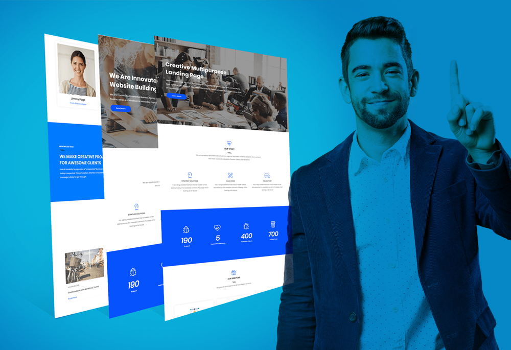
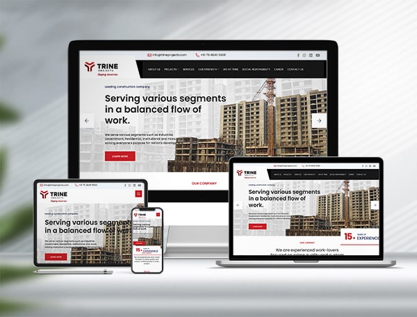
Yes, you heard it correct. 2018 can be the year for one page websites. Increasing use of smart phones (or to be more specific, ‘touch screen phones’) lead to the popularity of such websites as any user would prefer scrolling over struggling with multiple tabs and pages. See the example here.
But what are the advantages?
What would you choose – one single long page that contains all the information or the tedious process of navigating through the pages and menus?
Better User Experience
Better user experience is what led to its popularity. There is very little risk of user getting confused while visiting your site and ultimately abandoning it. The simplicity and effortlessness is what draws user’s attention. User can easily get relevant content without getting lost. Due to the content being short and crisp and up to the mark, the user can have clear idea of the intent which leads to high conversion rates.
Saving Bucks!
Also they are very cost effective as compared to the huge websites with multiple pages. So if your business is a new bee and you do not wish to invest a voluminous amount on website then you can easily opt for single page website.
Also it saves a lot of bandwidth due to it’s compact size so you can save a few bucks on hosting as well. Yayy! Its load time is less as compared to traditional websites because of the limited content which in turn reduces the bounce rate. On the contrary, traditional websites can have high bounce rate as multiple pages might take longer to load.
A sigh of relief for web developers
One page websites are a boon for web developers. Organizing content for a single page is much more effortless than doing it for a large volume. It is really easy to modify the content of your website and also provide the best maintenance.
Also there is no need to create a landing page for your website. It is always easy to include a call-to-action in such websites.
Simple Design
Now imagine you have a business website that represents many products and you are supposed to choose different layouts for different product. But instead of doing such tedious work, you simply use the same layout and just change the description. Can you have user engagement with that? A bit difficult.
It is much simpler to choose website design (also read: Top Seven Website Design Secrets For Internet Marketing Success) layout for single page websites which is not the case for traditional websites as it is a difficult task to select the design layout for multiple pages.
But one of the most important benefits of one page website is that you can control the way users learn about your enterprise. When visiting such websites, users follow a specific flow rather than navigating in a random order, which is distracting sometimes.
Does it have a downside?
Umm, yes it does.
One for all! – not possible
First and foremost drawback of one page website is that this format might not be suitable for all the business type. Like for E-Commerce business, with variety of products available, it’s impossible to provide information about everything on a single page.
SEO is difficult
Another major snag in using such websites is that its Search Engine Optimization becomes even more difficult. Since the content is limited, you can target only a few keywords and phrases which in turn reduces your chance of getting indexed. In case of traditional websites, with massive content available, you can target as many keywords and phrases as well as long tail keywords for different pages and increase your chances of getting indexed.
Load Time
You just have a single HTML page representing your business so presentation and design matters the most. User engagement and conversion rate highly depends on how well you represent yourself and how good your website looks in such limited space.
Sometimes in an attempt to make your website look attractive, a lot of text, or images, or videos are included which in turn increases the load time. Hence leading to more users leaving your website.
What framework and technologies should I use?
One page websites, as we know, does not contain a menu bar which sends you to different pages. Instead, it contains a single HTML page that transports you to different sections of the same HTML page. A good header that gives the clear idea of what section of the page you are on is important.
This kind of transition is typically done using JavaScript, jQuery, CSS3 and Ajax.
The fate
Increasing demand of mobile web has definitely increased the demand for one page website. With devices being more and more compact these days, one page website may set the trend in 2018. You can definitely think of one page website for your new project.
