The visual identity of any brand has a significant impact on its overall perception. For the Paris 2024 Olympics, the visual identity is particularly meaningful, inspired by culture of France and the Parisian spirit. It draws influence from the city’s architecture, fashion, cuisine, and history, creating a design that reflects both the essence of Paris and the grandeur of the Olympic Games.
Julie Matikhine, the Brand Director for the Paris 2024 Olympics, has brought together three main elements in the event’s visual identity. She includes symbols and landmarks from Paris, like the Eiffel Tower, incorporates elements of French lifestyle, such as a heart symbol to represent France’s reputation as the “country of love,” and reflects the sports and their venues. The design uses a mix of sharp lines and simple shapes arranged in a flexible grid, inspired by the Art Deco style from the 1924 Olympics held in Paris.
LOGO INSPIRATION
The Paris 2024 symbol beautifully combines three iconic symbols: Marianne, the Olympic flame, and a gold medal. This design elegantly captures the people-centered, inclusive spirit that France aims to bring to the Games. For the first time ever, the Olympic and Paralympic Games will share the same emblem in 2024, reflecting their unified vision and ambition for both events.

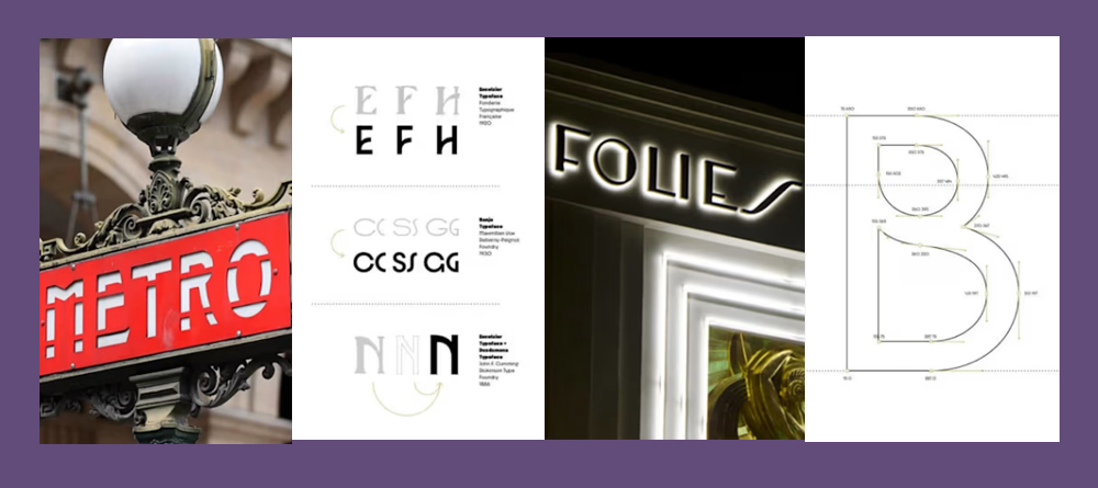
TYPEFACE INSPIRATION
Typeface inspiration from the Art Deco movement, it blends energy from sports with a minimalist and streamlined style. It is a powerful and refined design that embodies French elegance. This unique combination offers both fluidity and solidity, merging cultural heritage with sporting excellence for the first time.

COLORS INSPIRATION
The colour scheme tells a story and enhances the creative identity of Paris 2024. The main palette features black, white, and gold, reflecting the emblem. Additionally, seven secondary colours closely associated with France are included to capture the energy and enthusiasm of the event.

PICTOGRAM INSPIRATION
The 70 pictograms for Paris 2024 continue the theme of blending past and present. Referred to as “blazons” by Matikhine, these icons resemble delicate coat-of-arms symbols and act as “badges of honour.” Unlike Tokyo 2020, Paris 2024 pictograms don’t feature figures. Instead, each one includes three elements: an axis of symmetry, a depiction of the ground, and a representation of the sport. For example, table tennis features two paddles on a line-drawn table, while athletics shows two trainers on an ovular track.

The overall visual identity and look of the Paris 2024 Olympics showcase a vibrant blend of Parisian culture and Olympic spirit. With its Art Deco-inspired typeface, symbolic logo, and dynamic colour scheme, the design reflects French heritage and sporting excellence. The innovative pictograms combine traditional and modern elements, highlighting inclusivity and unity. At Kumbh Design Inc., we find the integration of tradition and contemporary design in Paris 2024 truly inspiring. This article may offer valuable insights for businesses, agencies and students, providing ideas for their own brand identity projects.
Below are the references used for the blog content and images.
https://olympics.com/en/paris-2024/the-games/the-brand/design_full_old
https://press.paris2024.org/photos/matikhine-julie-brand-director-d1f1-7578a.html


